START Interactive Showcase
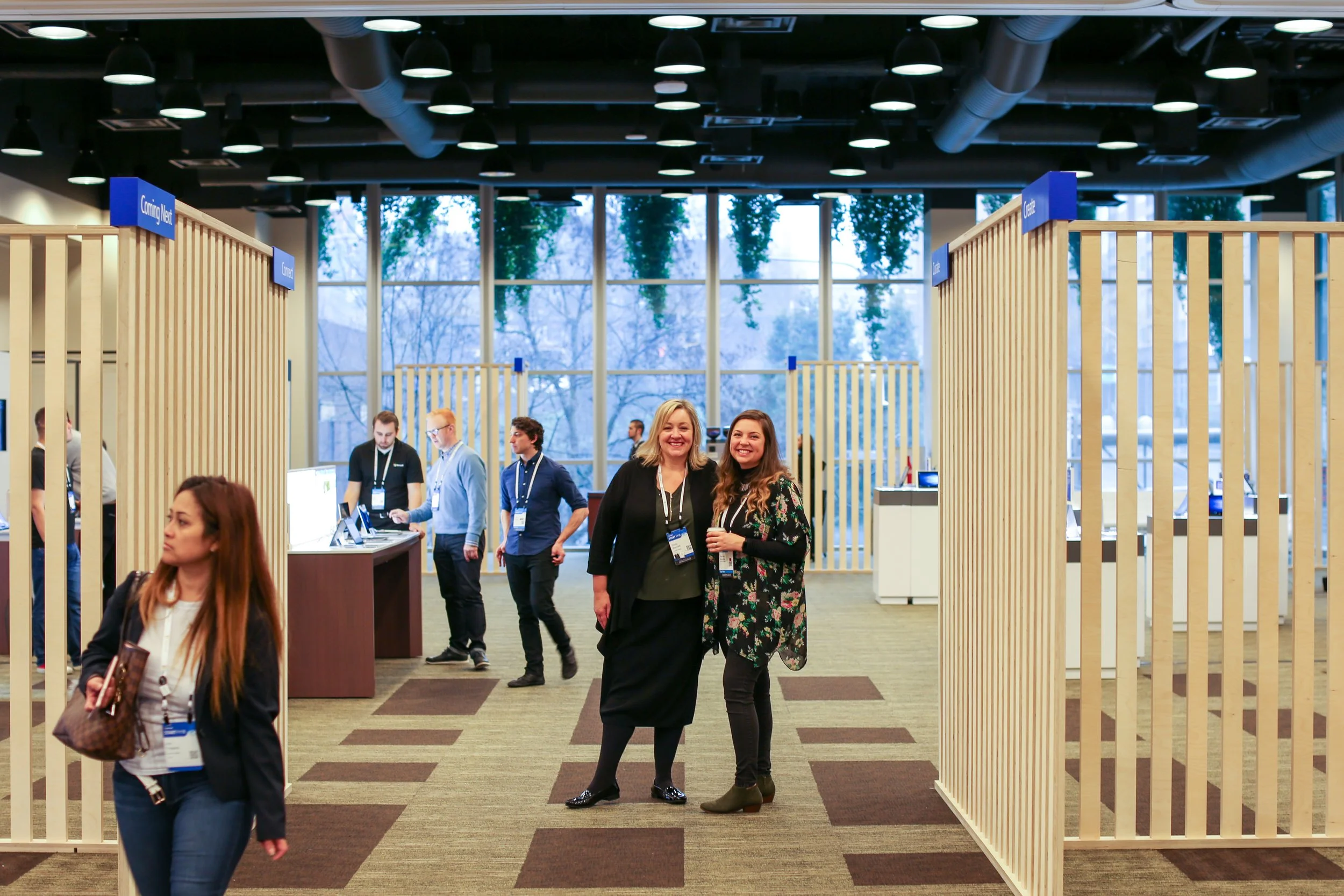
A Channel Marketing Interactive Showcase featured at the Microsoft event START.
My role
As the lead designer on this project, I was responsible for over all art direction. I partnered with Joo Nyguen and Nanda Sophrica to create a signage suite that included way-finding, table signage, table backers, handouts, and a table tent. I worked closely with the LOB booth owners to create sketches that fit the needs of the individual booth story. I partnered with a 3D artist Samuel Houk to bring to life booth sketches. In addition, I worked closely with the display and event production company.
Challenge
In 2017, my team was responsible for the creative direction of the Channel Marketing Interactive Showcase that would be featured as the pinnacle experience for START (Microsoft event) attendees. The goal was to create rabid fans and to inspire the audience to leverage what they learned in the conference breakout sessions.
In a short span of three weeks, we had to come up with a cohesive visual identity that partnered with the existing START brand and the individual lines of business in the showcase. Based on the budget we were asked to create new fixtures but also leverage old fixtures while accruing a premium level of accessibility, consistency, and quality.
The Journey
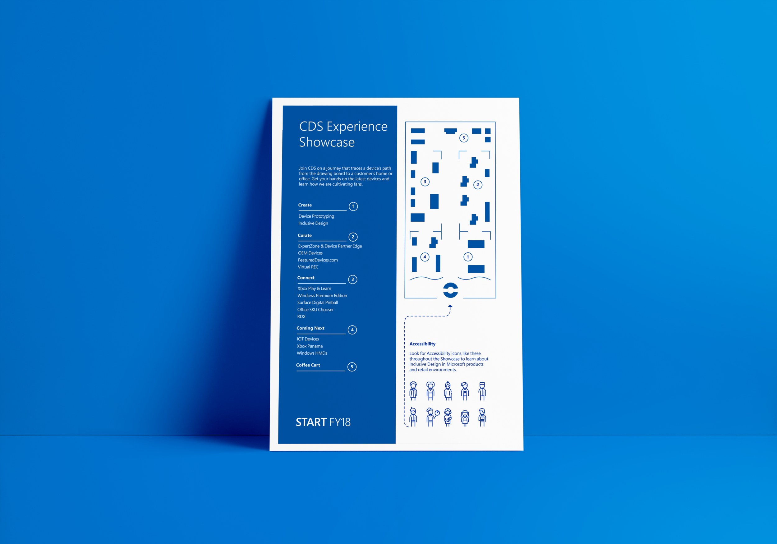
Where did we want our user to go in this space? How were we going to decide what went where? What was the cohesive thread from booth to booth? To address these questions, we came up with an overarching story line. The idea was to take our guests on a journey that traced a device’s path from the drawing board to a customer’s home or office, highlighting the key milestones where Channel Marketing played a role. Phases of the journey were, Creation, Curation, Connection, and Coming Next.
Concepts
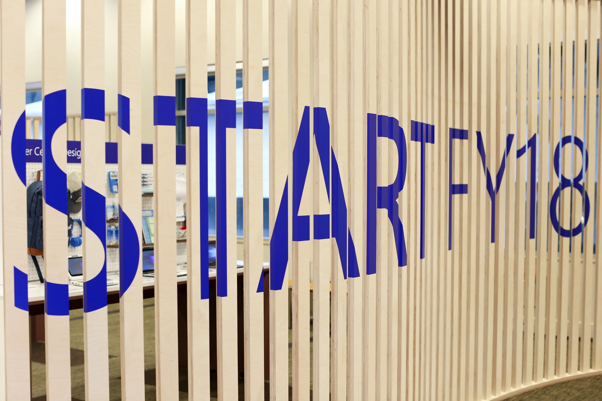
I presented three visual concepts. The winning concept featured large slat walls and a natural pallet that married well with the existing START brand. The journey and what drove the user to get through the space was just as important as the visual representation. This solution used line of sight to draw the user into the space with large slat walls that allowed the user to see just enough to be curious. I used the most classic shopping experience (getting milk at the grocery store), to inspire the placement of our coffee cart. Grocery stores usually put the necessities at the back of the store to drive users through areas they would not have gone otherwise.
Signage
We created a signage suite that included wayfinding, table signage, table backers, handouts, and a table tent. We leveraged wood left over from the slat walls to create the table signage holders.
Fixtures
Some of the booths required new fixtures. I worked closely with the LOB booth owners to create sketches that fit the needs of the individual booth story. The sketches were converted to 3D renders and sent over to a production company for final building. We were also tasked with reusing older fixtures. I spent a lot of time cataloging what was available in our warehouses, and divvying it up to the LOB that made the most sense. I then worked closely with the production company to bring the fixtures up to speed with our look and feel. This approach yielded a premium quality event for a fraction of the price.
Inclusive design
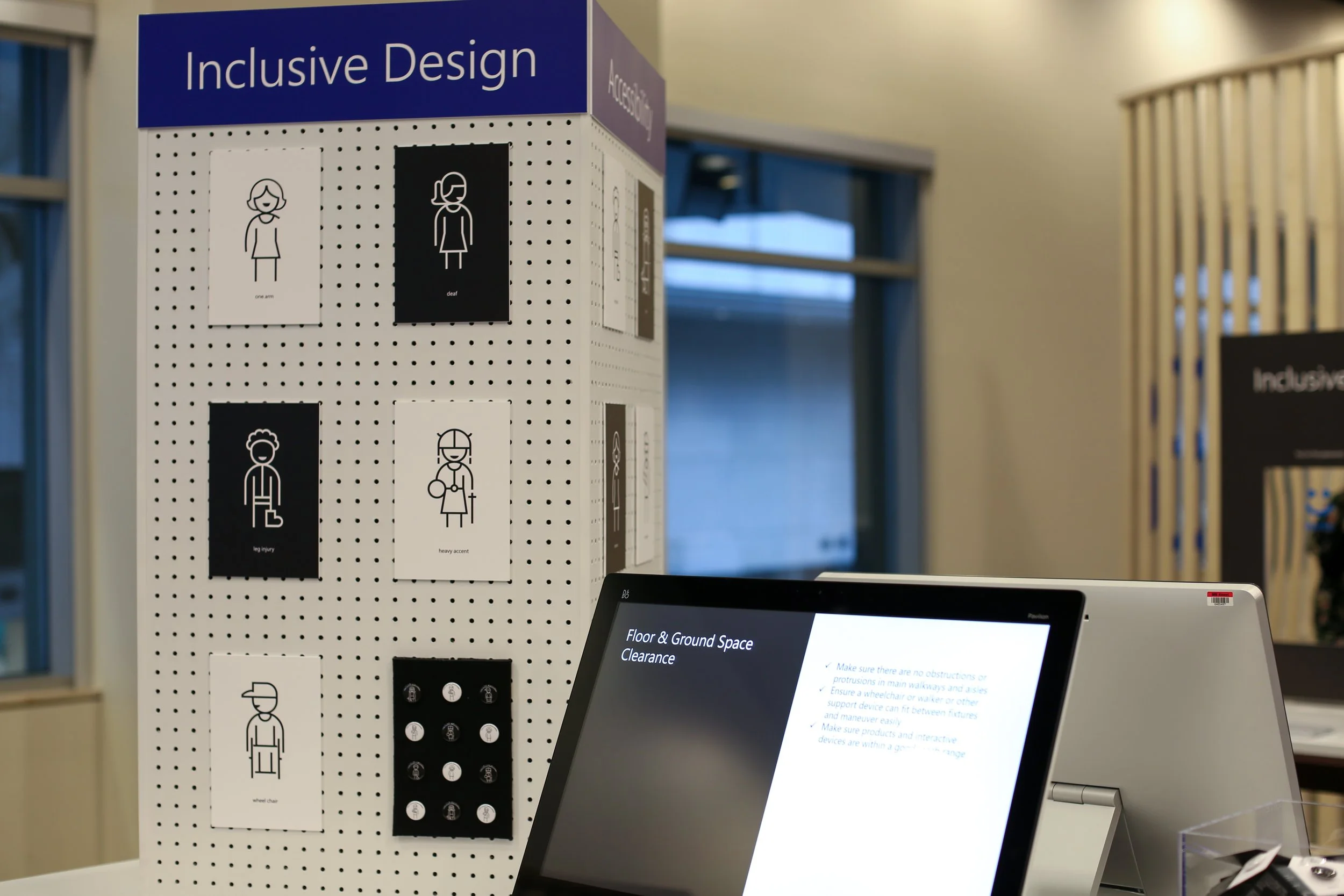
Microsoft’s Mission is to empower every person and every organization on the planet to achieve more. We worked with the Microsoft Accessibility Group to come up with iconography and a designated area to help users become familiar with Microsoft’s Accessibility and Inclusion efforts across products, people and programs. We included these icons on the table signs of each booth.
The booth started with a rough digital sketch. I worked closely with Imagicorps to refurbish an existing fixture, create a peg board display for the icons, and custom bin to hold handouts and pins.
Windows Hello IR camera
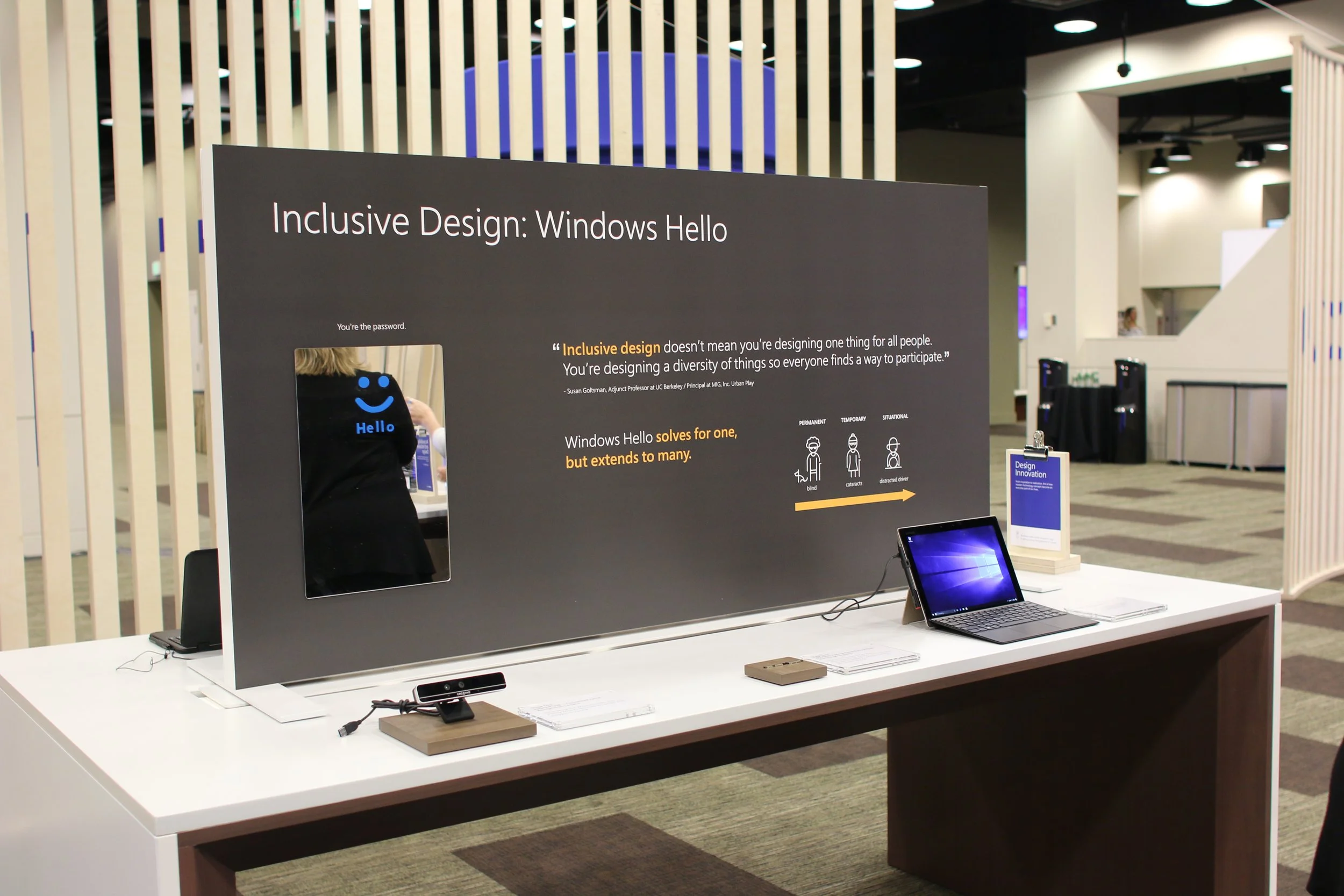
In this booth, we told the story of the Windows Hello IR Camera. The story touches on how Iteration after iteration led to a sleek integrated chip that enabled Windows Hello. Three iterations were displayed on the table showcasing the prototype journey. We took the opportunity to tie in Microsoft Inclusive design on the table backer where we showcased how accessible Windows Hello is.
Live streaming
Anyone in any line of business can live stream! This booth was centered around guiding others to grow their own LOB live stream program. We designed a custom booth and an infographic panel that focused on Xbox’s live stream success worldwide.
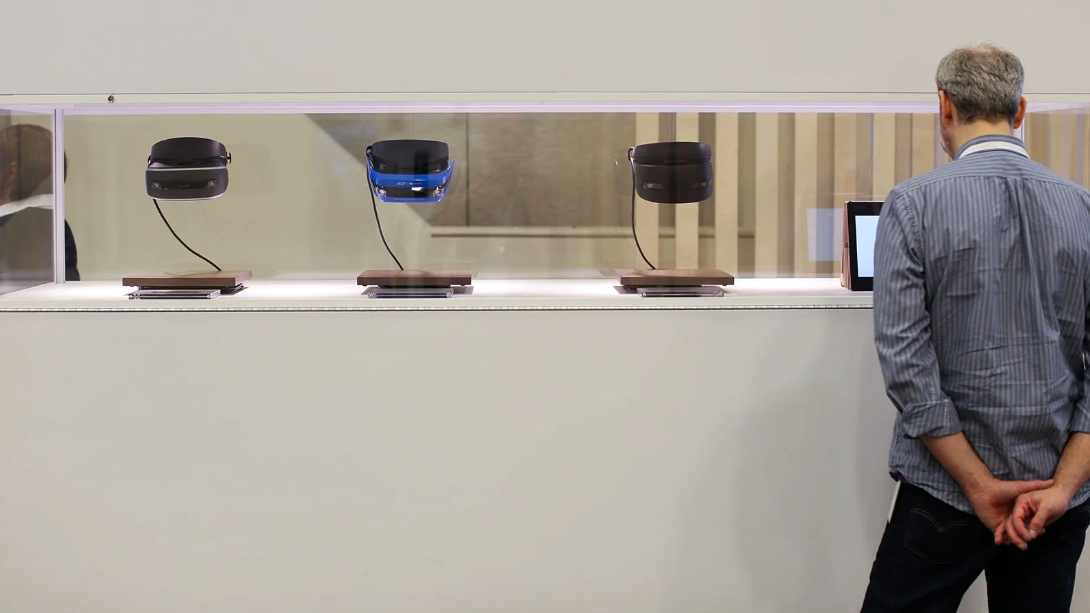
Windows mixed reality
The Windows Mixed Reality program was set to launch in 8 markets for Holiday. I worked closely with the Windows subject matter experts to create a premium quality display that focused on what was coming soon.
Key Results
Microsoft relies heavily on feedback. After the event, survey results were overwhelmingly positive. The showcase was voted the second-best experience at START. Many people stated that they would like to see this same showcase concept repeated at future events such as Ready/MGX, E3, CEO Summit, and others.
Other work
